The Transformation
Comparing the original website with the redesign based on user feedback and testing results


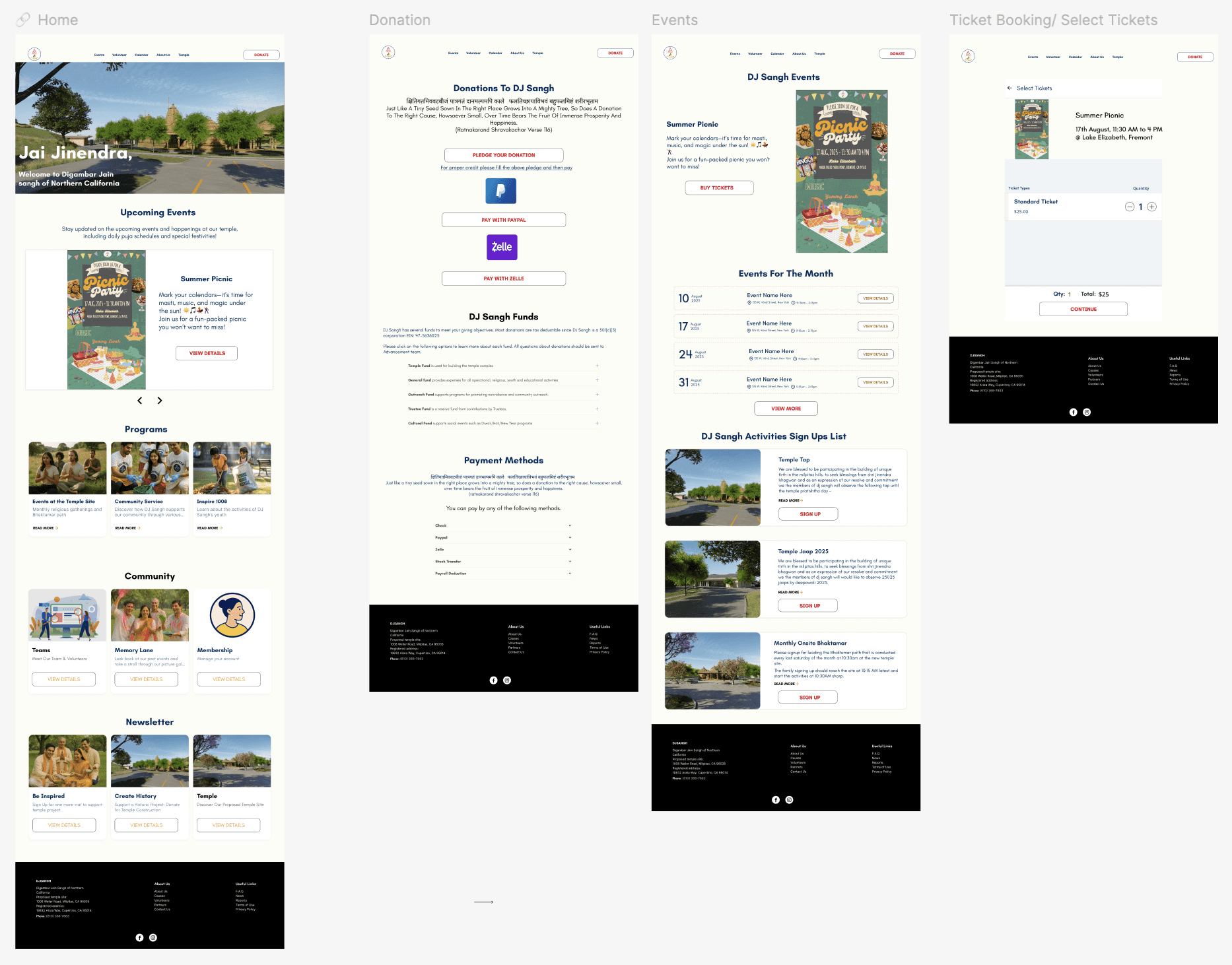
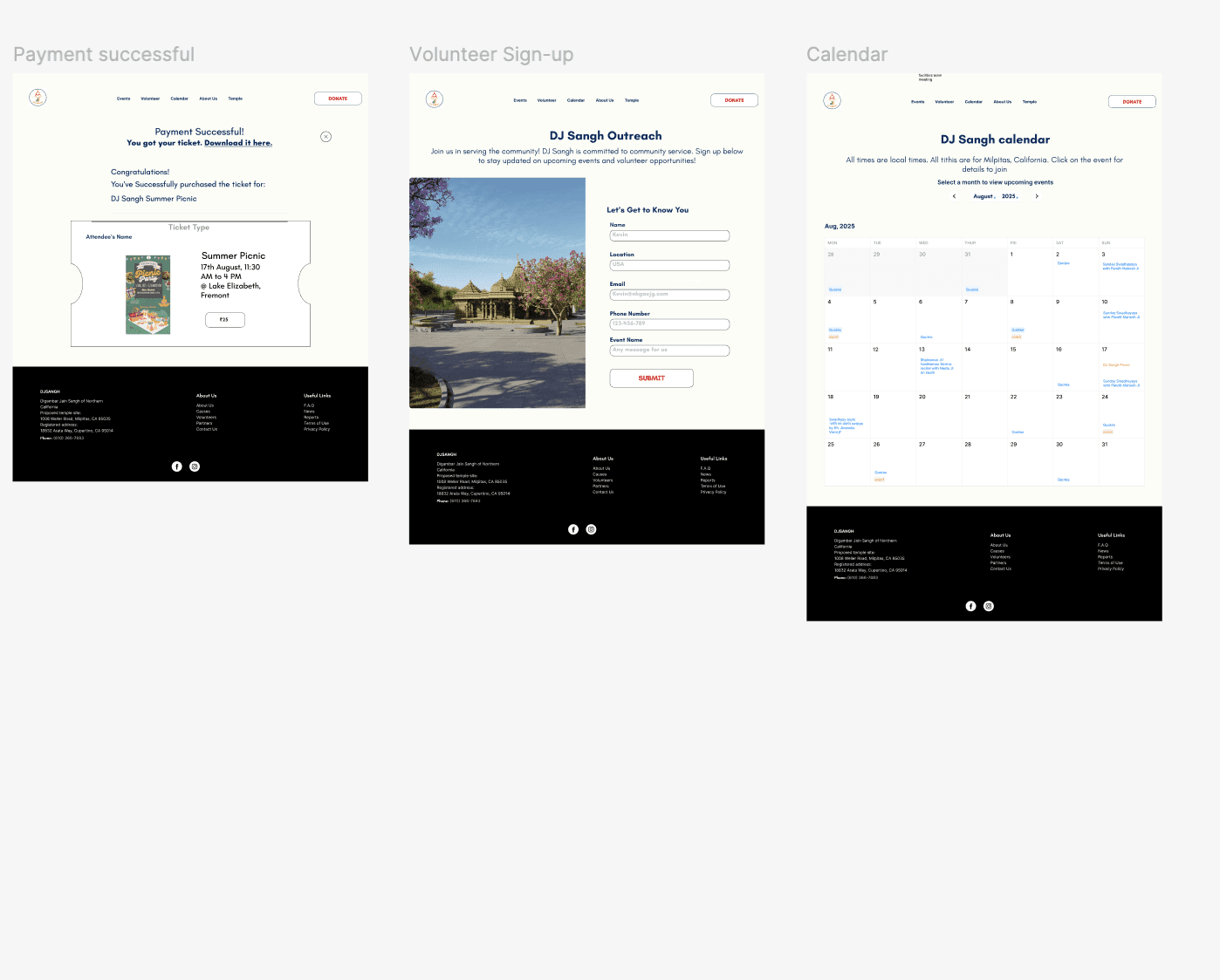
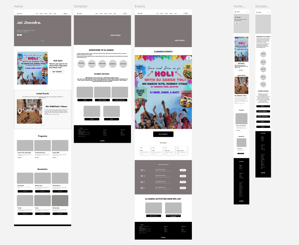
Redesigned Webpages
Reflections & Learnings
Working within an established brand allowed me to focus on solving usability problems rather than redesigning from scratch. The biggest challenge was navigating user resistance to change, which taught me to balance improvements with user comfort levels. Key learning: users prioritize clarity and easy access over visual complexity. This project reinforced the importance of listening during research, staying flexible with constraints, and designing practical solutions that address real user needs without overcomplicating the experience
Role:
End-to-End UX Designer
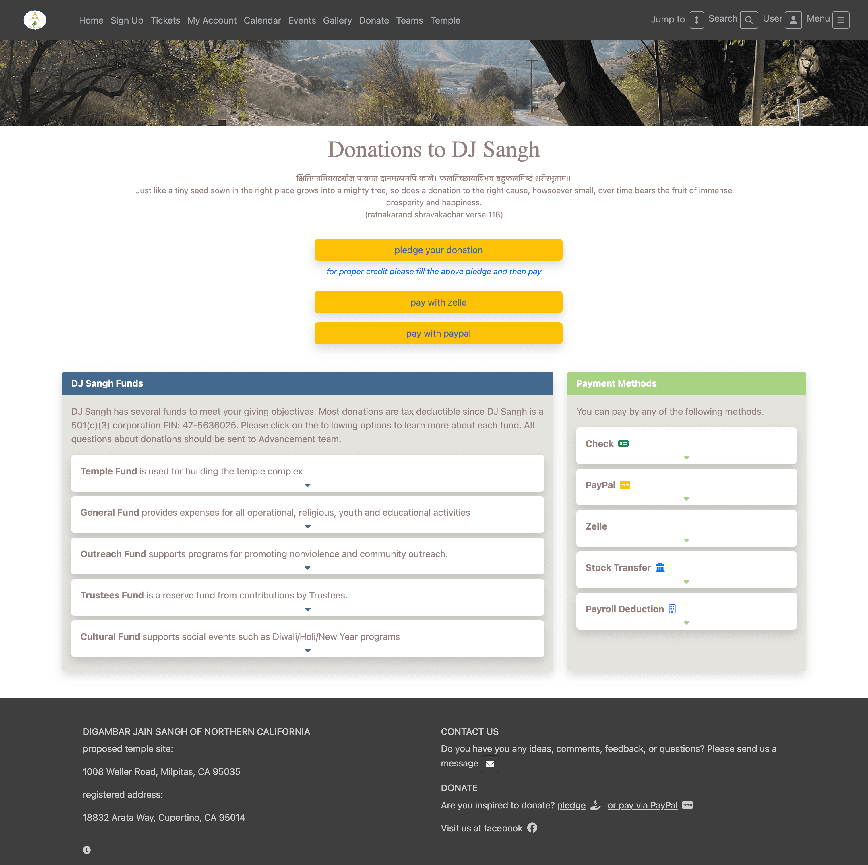
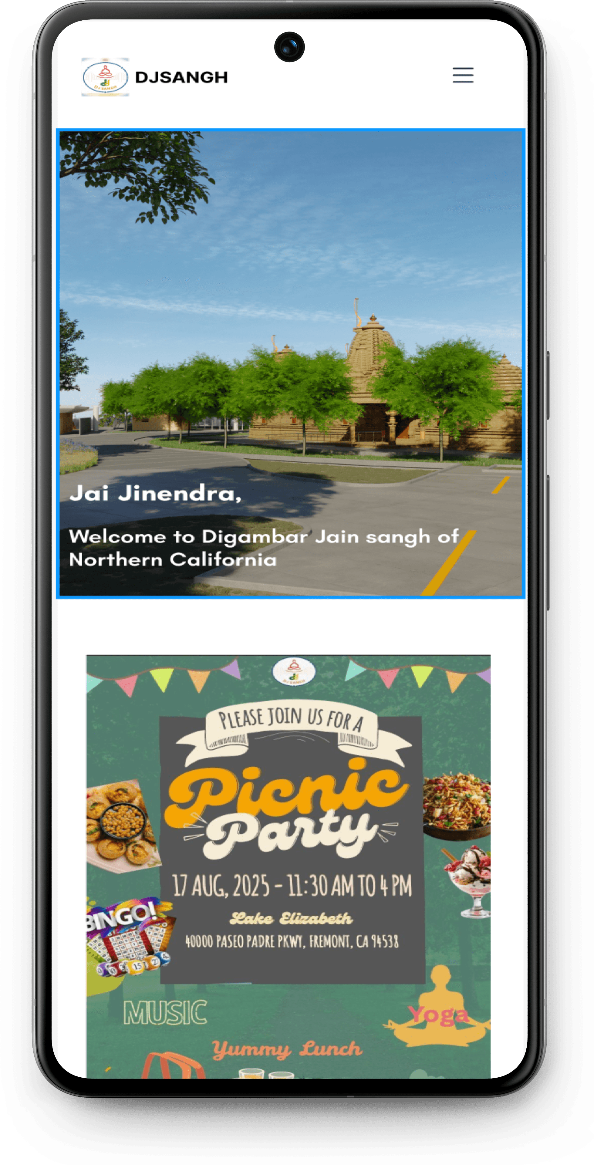
There was no mobile version of the original website
Macbook Pro

Testing with Users
I conducted three usability tasks with a total of five participants
Issues Identified
Task
Success
Rate
Key Findings
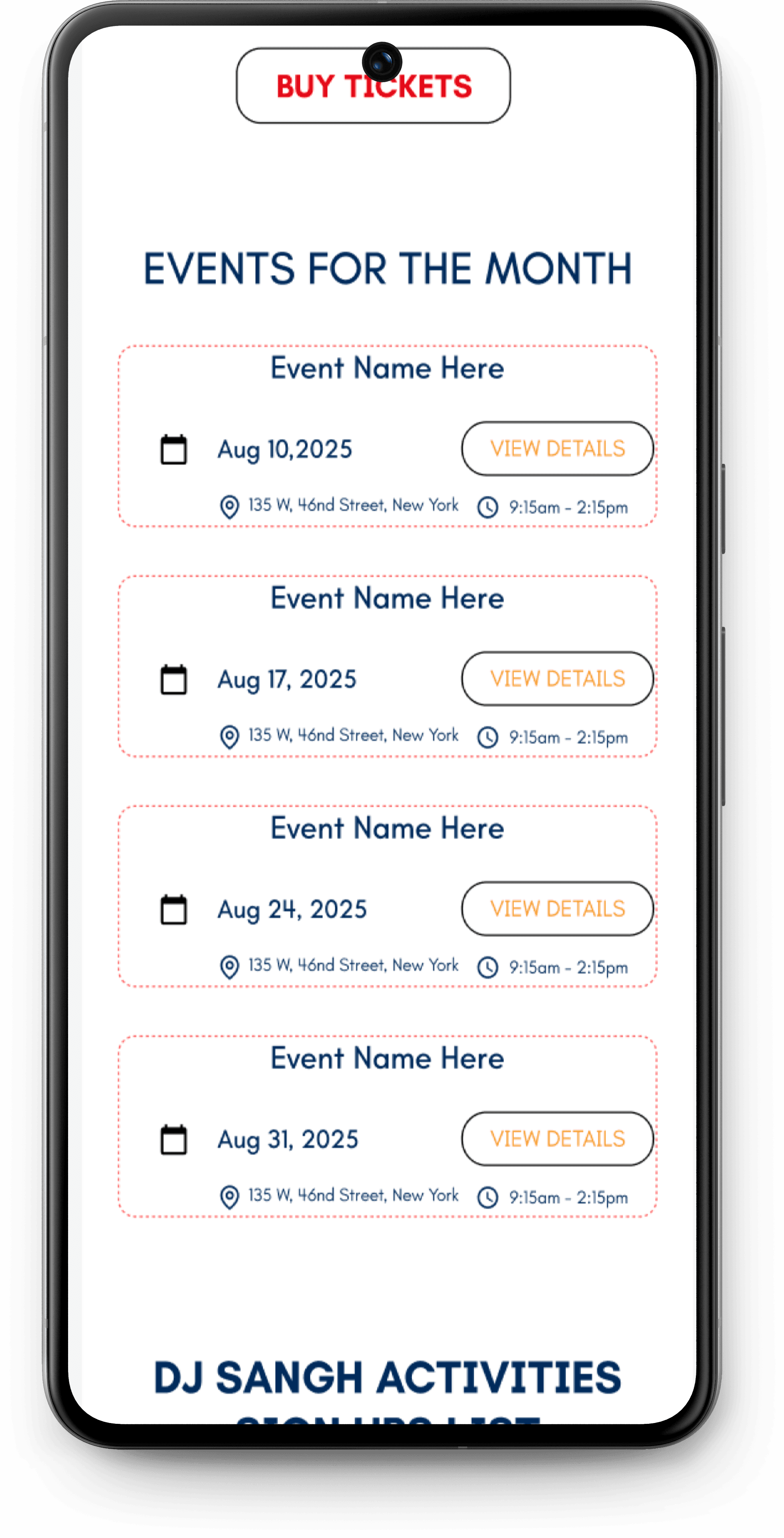
Task 1: Purchase tickets for upcoming summer picnic
5/5 (100%)
• 3/5 users clicked 'Buy Tickets' directly from homepage
• 2/5 users navigated via Events page first
• Both paths worked successfully
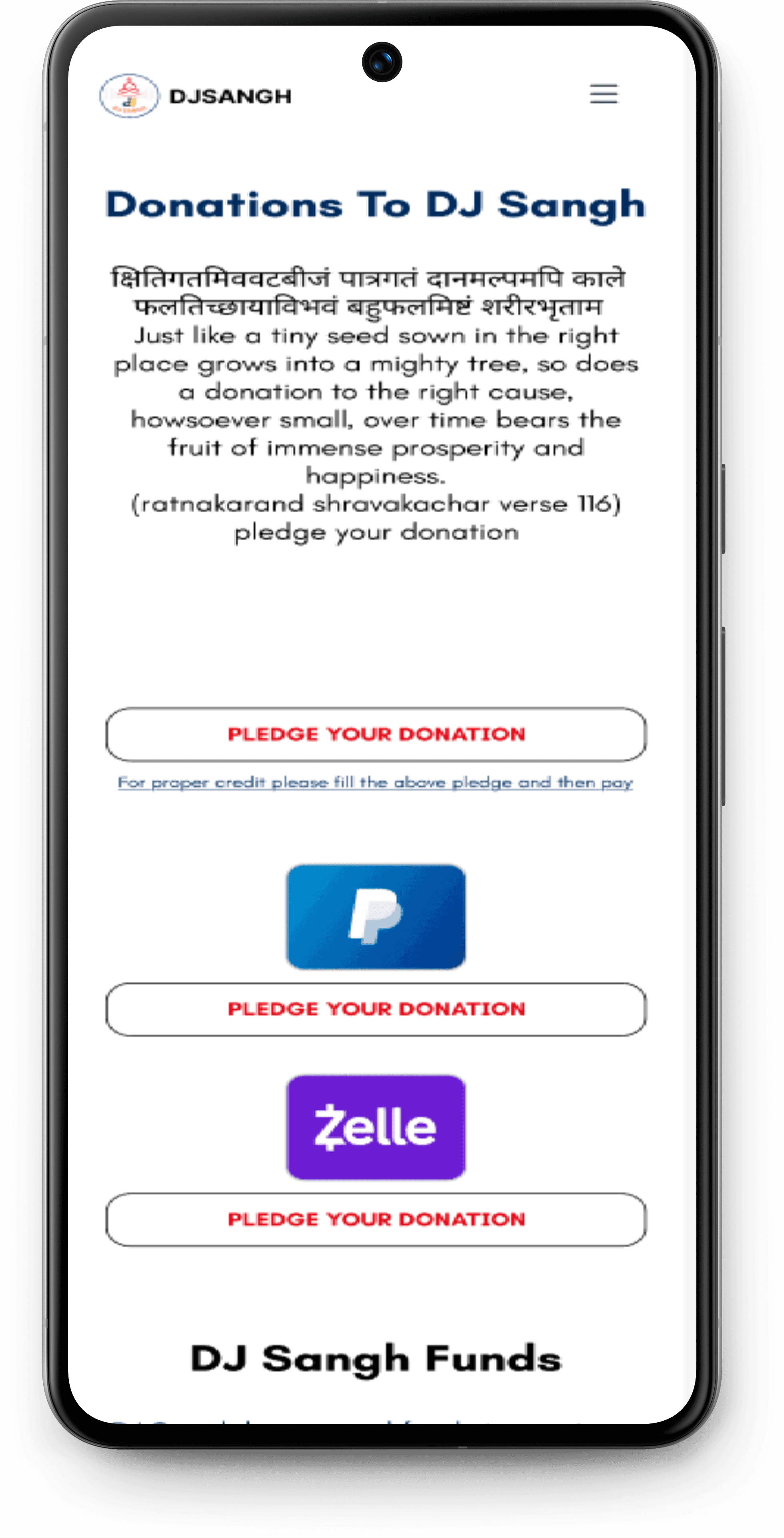
Task 2: Find donation information (cheque & temple fund)
5/5 (100%)
•5/5 users found information easy to access
• Collapsible format was well-received
• Content organization was clear
• Critical: Information couldn't be closed once opened
• 2/5 users noticed other content moved out of place when cheque info
Task 3: Find weekend event in August
• 2/5 users found back button functionality not smooth
• Back arrow placement was confusing
• 1 user wanted event picture shown on purchase confirmation
Information couldn't be closed once opened
• 2/5 users noticed other content moved out of place when cheque info expanded
• 2/5 users felt payment CTAs were too prominent/loud
5/5 (100%)
• All users: Events page → browsed → clicked "VIEW MORE" to reach calendar
• 5/5 users praised calendar UI design
None - smooth experience
Sketching The Foundation
I created low and mid-fidelity wireframes for initial testing based on the established branding, features, and project goals
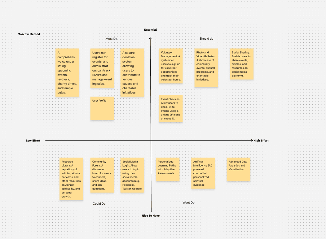
Project Goals

The community was open to changes in fonts, CTAs, and other UI elements
The feature set for the redesign of the website is derived from user research and the existing website
I based the website colors on the logo's color palette
FCFDF7
F7931E
E30613

The community wanted to keep the original logo unchanged, so I preserved it exactly as is
Branding
As this project involved redesigning an active website, I prioritized maintaining brand consistency throughout
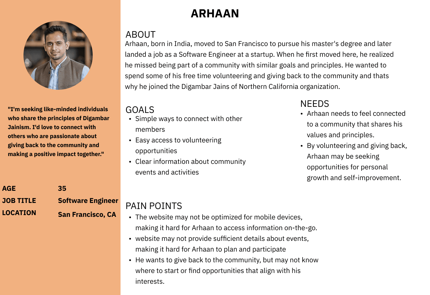
I created this persona by identifying common goals, pain points, and behaviors from user research and interviews
Key Insights
Event Discovery is the Primary Goal Users visit mainly to find upcoming events, festivals, volunteer opportunities, and ways to engage with the community.
Navigation is Confusing Multiple users struggled to find information quickly due to poor site navigation and organization.
Login Requirements Create Barriers Forced registration before viewing basic info (photos, event details) frustrates users and blocks access.
Information is Incomplete Users consistently found missing or insufficient details about events, activities, and the organization.
Design Feels Outdated and Dull All participants criticized the visual design as plain, unappealing, and not reflective of the vibrant community.
Calendar View is Needed Users want a visual calendar format instead of list view, with complete event details and timings.
Mobile Access is Essential Most users access via mobile, making responsive design critical.
Users Want Modern Features Requests include livestreaming, social media integration, donation transparency, and multilingual support for older generations.

To determine necessary website improvements, I conducted interviews with 5 active community members
Problem
The website is difficult to navigate, visually outdated, and lacks clear information hierarchy, making it hard for users to find information and understand the organization's purpose
Teachers, 40px
H2
Teachers, 32px
Body
Teachers, 50px
H1
Teachers, 24px
Body
View Details
View Details
Read More
Read More
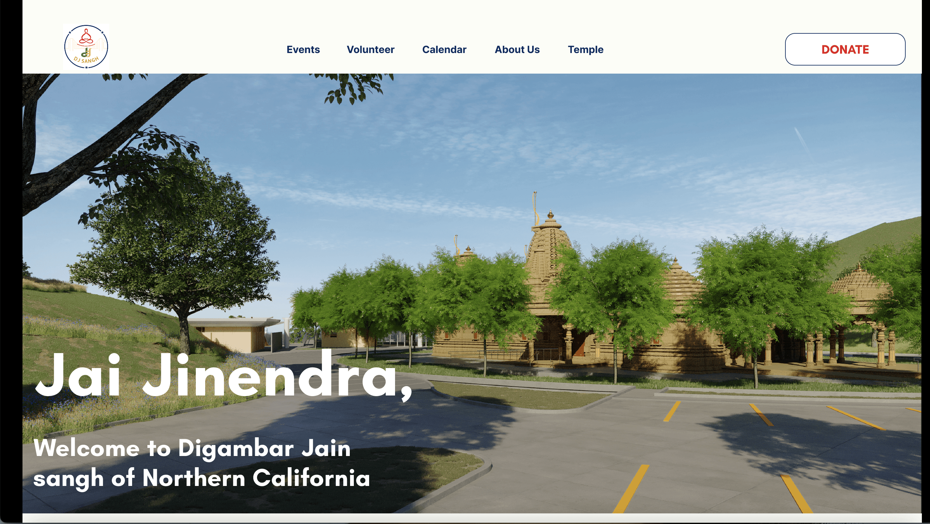
A responsive website for the Jain community featuring religious activities and events in Northern California
Website Redesign For DJNC
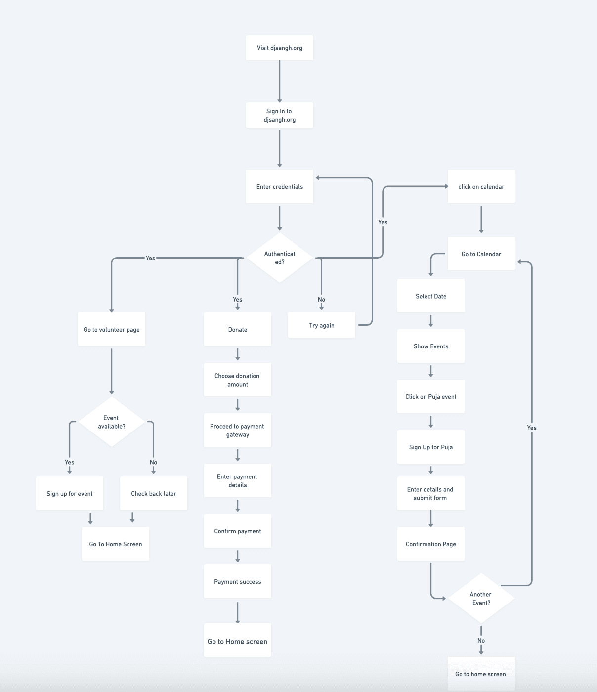
User Flow
HI- Fidelity Wireframes